Transforming B2B Wholesale for Real‑Time Decisions
UX/UI | e-Commerce B2B | 2021-2022
For this B2B wholesale distributor, the goal was to modernize a outdated e-commerce platform into a modern, data-driven experience that better supported both customers and sales consultants. With a catalog of more than 70,000 products and users spanning the U.S. and Canada, the existing site had become inefficient and disconnected from how people actually worked. Our task was to understand how the current systems shaped those behaviors, uncover where friction existed, and design a solution that simplified ordering, strengthened relationships, and empowered every user along the way.
My Responsibilities
Led research, discovery, and design efforts to shape a user experience that translated user and business needs.
Partnered with the lead developer to align designs with technical feasibility.
Guided the junior designer through execution of day-to-day tasks.
Delivery Team
Lead UI/UX Designer (me)
Junior UI/UX Designer
Lead SaaS Developer
Process Overview
Research & Discovery
This project required clear and accurate organization of account-related information across the site. I began by understanding what each user type needed to see—and where they expected to see it—to support efficient ordering, tracking, and reordering.
Journey Mapping
With the overall site map and page flow already in place, I focused on mapping features at the page level to understand how information flowed and which elements needed to be visible, actionable, or referenced across different touchpoints.
Wireframes & Comps
The client requested we skip wireframes, so I jumped straight into comps—focusing on clarity, usability, and tailored layouts. Many screens required multiple versions based on login status or user type, ensuring the right information appeared in the right context.
Research & Discovery: Defining the “why”
How Did We Get Here?
Before exploring solutions, I first needed to understand how existing tools and processes shaped both customer and staff behavior. What surfaced was not just an outdated website, but an ecosystem of disconnected systems that made everyday tasks unnecessarily complex.
The company’s legacy site had grown increasingly complicated over time, with separate systems for browsing, ordering, and account management.
Customers often relied on their assigned sales consultants to place and track orders manually, sometimes using pen and paper while visiting retail clients.
Order fulfillment was fragmented, with shipments coming from multiple warehouses, making tracking difficult and confusing.
Limited visibility into order and account data created friction for both consultants and customers, ultimately slowing the purchasing process.
Why Is It Necessary?
After analyzing the workflows and system dependencies, it became clear that the experience needed to shift from reactive to proactive. The redesign had to empower users with tools and information that supported confident, independent decision-making while maintaining the personal relationships that defined their business model.
Existing customers needed quick access to order history, invoices, and shipping information in one place, while sales consultants required a streamlined mobile experience to serve clients on the go.
For prospective customers, the site also needed to communicate value clearly and guide them seamlessly through the application process.
The goal was to create a unified, user-centered platform that simplified ordering, improved transparency, and strengthened relationships between consultants and customers.
“Sales Consultants are writing orders on note pads and the customer service team is flooded with questions about shipping. It’s ridiculous!”
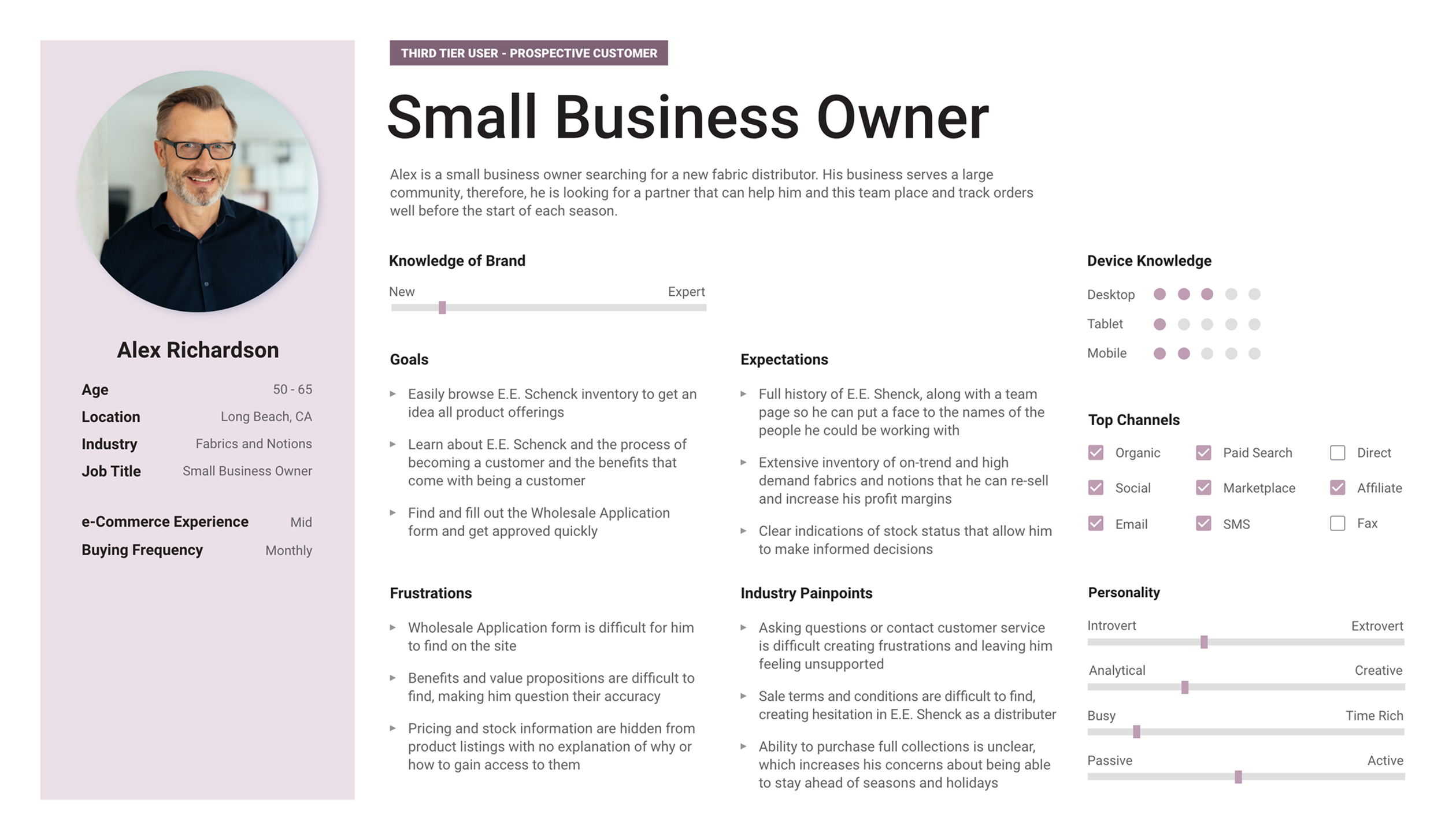
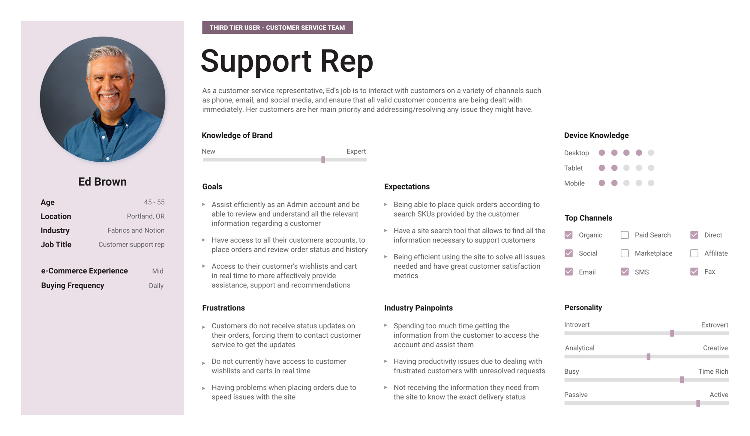
User Personas
I created user personas for primary, secondary, and third-tier users to guide design decisions and anticipate experience gaps. Primary users included purchasing managers and sales consultants; secondary included new customers; and third-tier represented prospective customers and sales representatives.
My goal was to go beyond surface-level needs and understand how each user arrived at the site, what they expected to accomplish, and where pain points might arise. I evaluated brand familiarity, goals, frustrations (both personal and industry-specific), common access channels, and even personality traits. This process helped me establish a baseline for user needs—one I aimed not only to meet, but to exceed throughout the experience.
-
![Primary user - Purchasing Manager]()
Primary User - Purchasing Manager
-
![Primary user - Sales Consultant]()
Primary User - Sales Consultant
-
![Secondary User - New Customer]()
Secondary User - New Customer
-
![Third Tier prospective customer]()
Third Tier User - Prospective Customer
-
![Third Tier user - Customer Support Rep]()
Third Tier User - Customer Support Rep


Key Takeaways
Users need to make fast decisions with confidence. Purchasing managers and consultants both rely on the ability to act quickly, with the flexibility to dive deeper into product details when needed.
Real-time visibility builds trust. Accurate tracking, order history, and status updates are essential for users to feel in control and confident in the platform.
Efficiency depends on clear access to actions. Quick actions must always remain visible, allowing users to complete frequent tasks without searching through layers of navigation.
Reliable data drives relationships. The site must serve as a single, trusted source of truth, providing up-to-date information that strengthens both customer and consultant interactions.
Designing for humans means designing for partnership. The platform should empower customers with autonomy while supporting the consultants who help them succeed.
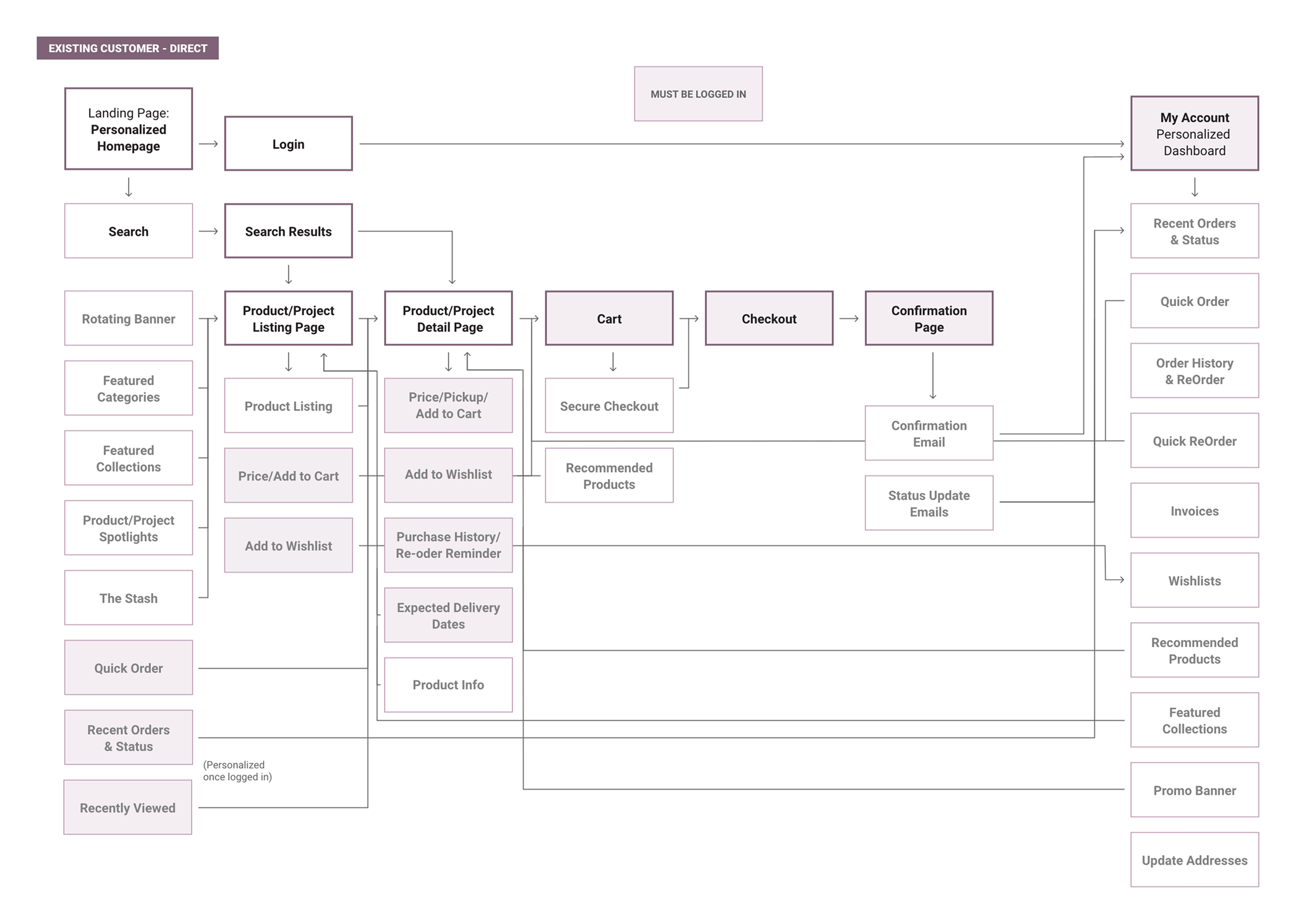
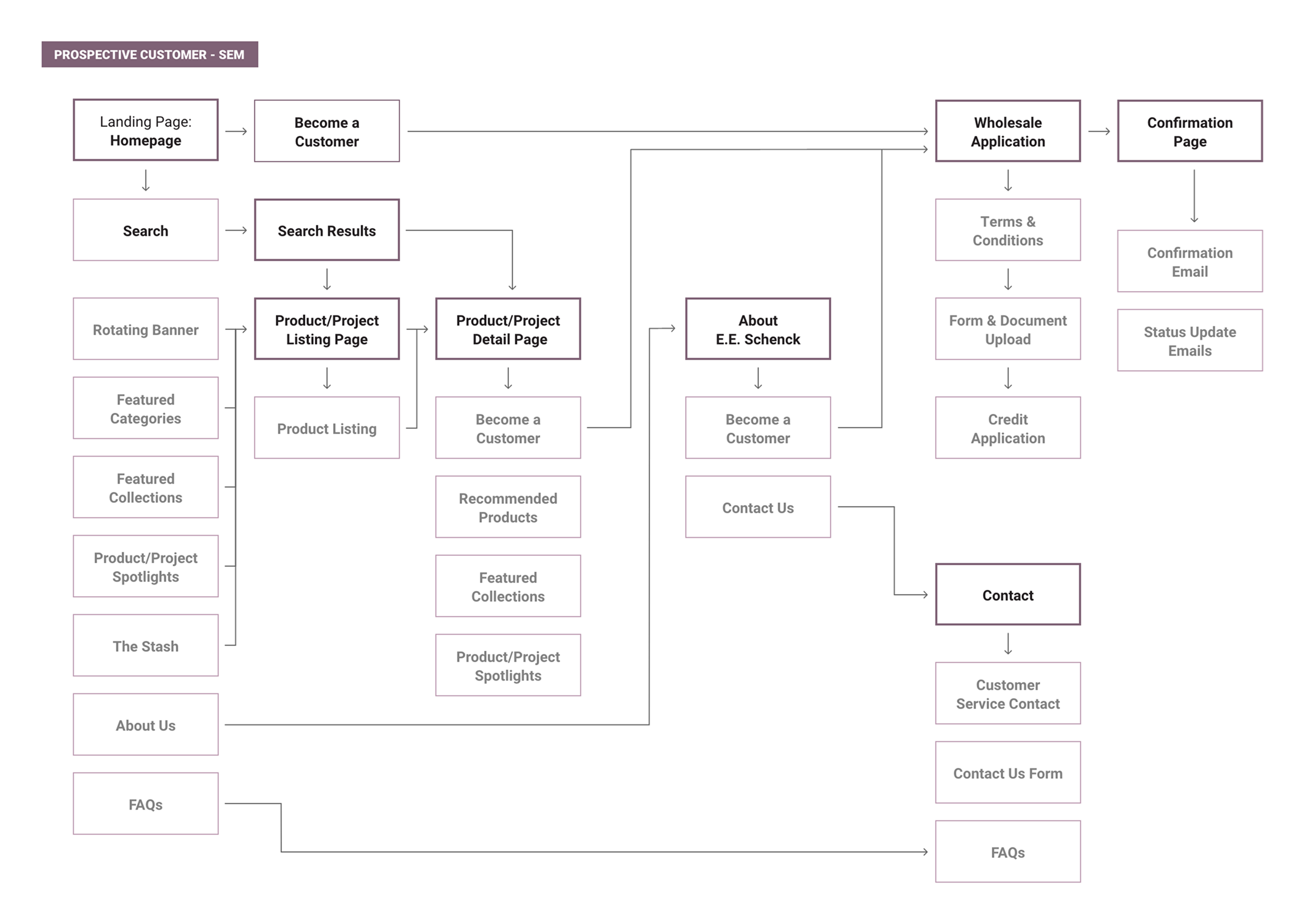
Feature Mapping
The experience is mapped step by step to show how content and functionality flow from the homepage through product pages. Core flows are:
Existing Customer
For existing customers arriving directly, after logging in, they have immediate access to full product details, recently viewed items, and order history woven into the shopping experience.
Quick actions like reorder, wishlist, and order status updates were strategically placed throughout to keep decisions fast and effortless, elevating a standard wholesale flow into something notably more intuitive.
Prospective Customer
The journey for prospective customers balanced easy exploration with clear paths toward becoming a customer. Without full product access, these users still needed enough visibility to confirm the vendor could meet their needs.
I used strategic content gaps to guide them naturally toward the application process, filling those spaces with links to apply and FAQs so they always knew how to take the next step.
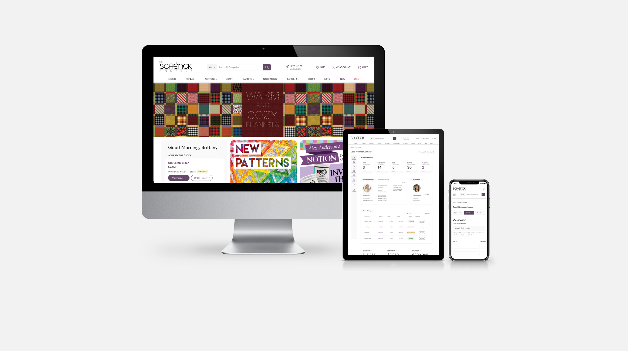
Final Comps
Homepage
The homepage saw the most dramatic transformation, evolving from an outdated design into a modern, streamlined experience.
Navigation was simplified to focus on primary tasks and dynamically adjusts for logged-in customers versus new visitors—directing prospective customers toward becoming customers, while giving existing users immediate access to account details.
Product discovery was elevated with clear category selections, featured collections, new arrivals, and an expanded search for faster, more intuitive browsing.
Just below the hero image, a personalized action card mirrors this adaptive approach, presenting quick, relevant options based on user status to keep the experience seamless for every type of visitor.
Scrollable ↓
Old Site
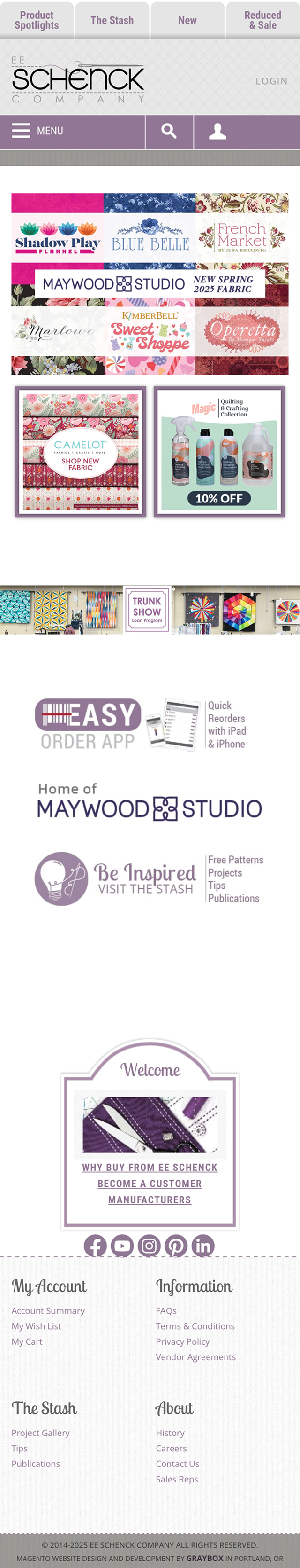
New - Prospective Customer
New - Existing Customer


Personalization for Existing Customers
An above the fold summary of their most recent order, shipping status and quick links to order history and wishlists.
Dynamic headlines enhance personalized experience.
Full product details are only visible to logged-in customers to prevent competitor access.
Recently viewed products are also displayed for logged in users, allowing them to quickly pickup where they left off.
Purchase Flow
The purchase flow encompassed product pages, views for both prospective and logged-in customers, the cart drawer, and the full cart page. Each screen was designed with a focus on information hierarchy. Product pages balance detailed specs with clear calls to action, preventing the eye from getting lost in dense content.
The cart drawer and cart page organize items into expand/collapse categories, helping customers manage orders and see subtotals at a glance. Because research showed customers often have very large, complex orders, the full cart page also includes a delivery summary at the bottom, giving users a clear picture of when to expect their items.
Product Page - Prospective Customer
Scrollable ↓
Product Page - Existing Customer


Cart Page
Cart Drawer
Customer Account
The customer account section was designed to eliminate the frustration of digging for details by making every critical data point easy to find and act on. The Account Dashboard serves as a central hub for the customer’s business, presenting a clear snapshot of activity: summary cards for open and backorders, shipping, and invoices, plus quick-contact options for their sales rep. Purchase patters in invoice data is easy to track with toggleable charts for month-to-date, year-to-date, and last year’s stats. Trending data highlights which vendors and categories they buy from most, prompting smarter decisions without overwhelming them with raw numbers.
The Invoice page extends that philosophy, presenting purchases grouped into categories with subtotals that mimic the cart experience. Payment and shipping statuses are prominently displayed, so customers immediately understand what’s been ordered, where it is, and what’s next—removing guesswork and turning their account into a tool they can truly rely on.
Account Dashboard

Invoice Details
Sales Consultant Account
Sales consultants are given full access to their customers’ logged-in experience—including dashboards and account pages, because many clients rely on them to manage and track purchases on their behalf. This access allows consultants to stay ahead of invoices, track open orders, and use trend data to guide meaningful conversations with customers. It empowers them to combine their expertise with real-time account insights, making recommendations that are both informed and actionable.
The sales consultant landing page is an account list view, providing a snapshot of open orders for each customer and quick links to key tools like the account’s Quick Order form or POS data. Clicking on an account name opens that customer’s dashboard, while a dedicated Quick Order navigation button saves valuable time—allowing consultants to jump straight into placing orders without scrolling through their entire account list.
Scrollable ↓
Landing Page
Account Dashboard


Quick Order Form - Search
Quick Order Form


Conclusion
This redesign transformed a dated wholesale platform into a modern, intuitive tool for both customers and sales consultants. By integrating account data throughout the experience, prioritizing quick actions, and addressing the complex needs of large orders, the site became a hub for smarter, faster decision-making. I left the agency for another opportunity before the project progressed into development, but with all design comps approved, I had full confidence in my team to see the vision through to completion.
Key Takeaways
Refined my discovery approach: how to balance my team’s process needs with the client’s push for speed. Uncovering the “why” behind their existing workflows was key to informing smarter design decisions.
Integrating account data across the site required identifying potential constraints early, ensuring they were addressed before becoming roadblocks that could impact the timeline.
Grew as a design leader, managing day-to-day tasks while learning how to teach, guide, and support my team—not just do the work myself.