Designing Connection in a Healthcare App
UX/UI | Mobile App Design | 2024
How can an app foster human connection and improve patient experience? For my client, a healthcare provider, the existing app was outdated and underutilized, leading their marketing team to focus patient engagement elsewhere. Our research revealed that patients deeply valued personal connections with staff, while the staff themselves were overwhelmed with administrative tasks. The challenge was clear: design an app that not only streamlined operations but also preserved the human touch patients relied on. This redesign aimed to empower both patients and staff—enhancing engagement, improving workflows, and making technology a supportive extension of their care experience.
My Responsibilities
Led end-to-end design efforts to shape the user experience
Worked closely with the tech team to ensure usability remained intact through project pivots
Mentored and guided junior designers throughout the design process
Delivery Team
Senior UX Designer (me)
Junior UX Designer
Junior UI Designer
Solution Architect
Lead Cloud Application Developer
Process Overview
Research & Discovery
Understanding both patient and staff perspectives was essential to designing meaningful change.
I conducted a competitive analysis to identify best-in-class features, led in-person patient focus groups to uncover real needs and behaviors, and facilitated stakeholder ideation sessions to align on priorities.
These activities helped reveal where technology could enhance, not replace, the human connection in care.
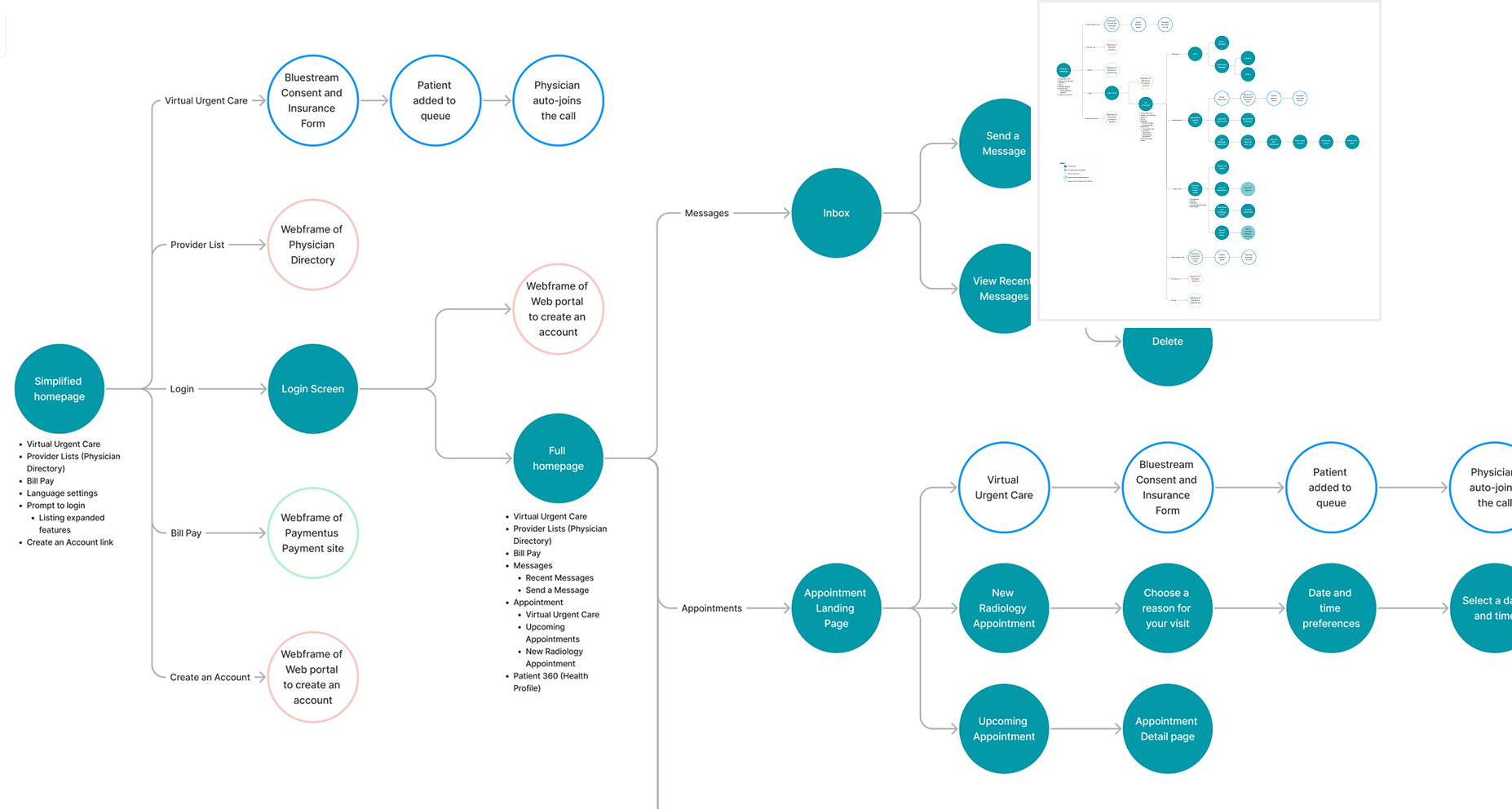
Journey Mapping
Because features would be released in phases, I mapped user journeys for both the MVP and future enhancements.
These maps visualized how patients and staff would interact with the app over time, helping to uncover friction points, dependencies, and opportunities to strengthen the overall experience as the product evolved.
Wireframes & Comps
Once the strategy was defined, the design team translated insights into tangible design solutions, focusing on layouts that balanced simplicity with scalability.
I guided the team throughout the process, providing feedback on usability, visual hierarchy, accessibility, and consistency to ensure the designs aligned with our goals. I also encouraged junior designers to take ownership of specific flows and present their work to stakeholders, helping grow their confidence and communication skills.
Research & Discovery: Defining the “why”
How Did We Get Here?
Before jumping into solutions, I needed to understand how the existing systems shaped both patient and staff behavior. By uncovering these constraints, I could see that the issue was not just a broken app, but a misalignment between organizational priorities, user trust, and technological capability.
The organization’s app had become outdated and underused, to the point where marketing actively directed patients away from it.
Over time, staff developed workarounds to fill the gaps, and patients grew to rely on personal relationships with their providers instead of digital tools.
Existing contracts with third-party vendors limited how updates could be made, often forcing additional process workarounds and preventing the system from evolving as needs changed.
Budget limitations tied to grant funding also meant the team had been forced to prioritize short-term fixes over foundational improvements.
“Quick wins will keep everyone on board.
Just make sure everything works and continues to work.”
This quote from a client stakeholder emphasizes their staff’s
frustrations and distrust of existing technology and their hesitation
to endorse promised improvements.
Why Is It Necessary?
With a clear understanding of the organizational and technical constraints, the need for change became undeniable. Reimagining the app was not just about modernization; it was about restoring trust, improving efficiency, and using design to extend the human connection that patients valued most.
Patients’ comfort with technology spanned a wide spectrum, from those eager for self-service options to those who relied entirely on in-person assistance. The app needed to meet both groups where they were, providing flexibility and accessibility without creating barriers.
At the same time, staff needed relief from manual, time-consuming tasks that technology could easily streamline.
“I don’t know what anything means.
I just ask Dr. Google”
Patient response when asked which health or wellness apps they
currently use, highlighting a preference for familiar tools over the
risk of confusion with something new.
Patient Focus Groups
I led two focus groups with the provider’s existing patient advisory council to understand their experiences, both digitally and in person.
These sessions gave patients a platform to share their struggles, including long wait times, unclear instructions, and difficulty keeping track of routine care. A central source for timely, reliable information emerged as a key need, though many, especially older patients, were hesitant about too much digitalization, valuing their personal relationships with staff.
Synopsis Presentation Slides: Overview


What are your favorite mobile apps?
What are your favorite health-related apps?
What is your most common interaction with the hospital or clinics?
How would you rate your current digital experience?
If you rated 3 stars or lower, what was your experience?
If you rated 3 stars or higher, what was your experience?
How does your digital experience differ from your offline experience (in-person, phone)?
What features would you most like to see in a healthcare app?
Is there a key digital experience you feel we haven't touched on yet?
Patient questions were written to prompt open discussion with my team, provider staff and each other.
Synopsis Presentation Slides: Actionable Observations


“Can’t you just look at what everyone else is doing? That way we don’t have to come up with a list of features. What’s working for other them?”
I heard this over and over again during stakeholder interviews.
So I took a deep dive into their competitors to give them a baseline
list of features and their “best in class functions” to react to.
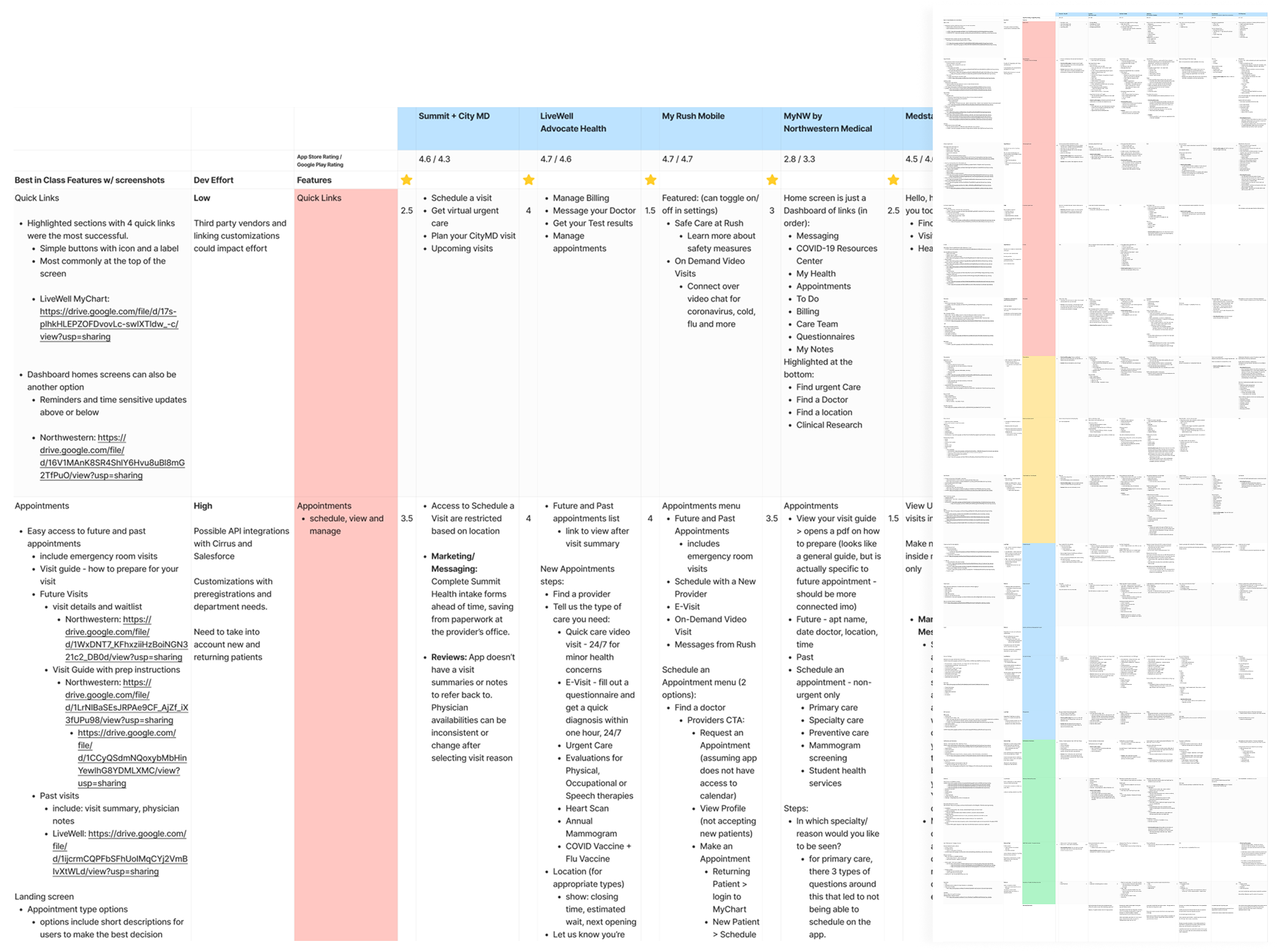
Competitive Analysis
To align with the client’s goal of elevating industry standards, I conducted a competitive analysis evaluating apps from top providers, as well as, local competitors. Each app was assessed for features, functionality, and user reviews. Next an overall score out of five was assigned.
None of the apps functioned perfectly, so I identified the strongest aspects of each, to create a "Best in Class" solution. I then ranked and color-coded features by user impact while the development team categorized them by effort and technical constraints. This structured approach became an invaluable tool for prioritization, ensuring we stayed on time and within budget.
Key Takeaways
Understanding context first was critical. By uncovering the organizational constraints, patient behaviors, and staff challenges, I could clearly define the “why” before exploring the “how.”
Patients value connection over convenience. Focus group discussions revealed that trust and familiarity play a bigger role in digital adoption than functionality alone.
Technology should support, not replace, the human experience. The research reframed the app’s purpose as a bridge between patients and staff rather than a barrier.
Competitive analysis guided best-in-class solutions. Evaluating existing healthcare apps helped identify effective patterns and gaps, allowing us to combine the strongest elements into a more holistic experience.
Journey Mapping
Full App: MVP Features
With a phased rollout approach, I had to design for the present while setting a strong foundation for future expansions. The user journey mapping for the MVP phase focused on bringing the app to market with quick-win features and introducing virtual care through a third-party vendor.
Feature Deep-Dive: Scheduling
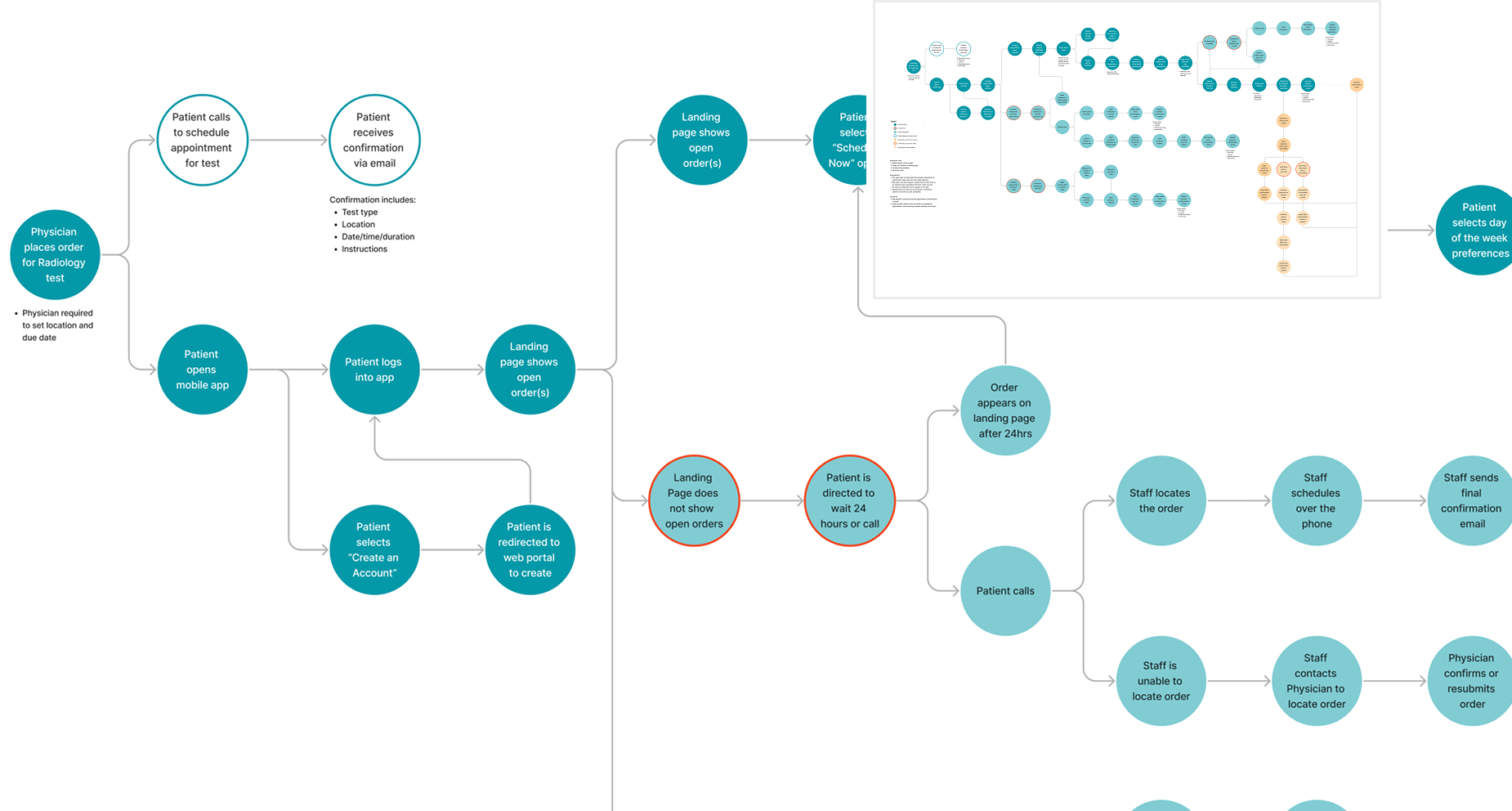
Appointment scheduling was expected to have the highest user impact, giving patients more control over their care. Radiology mapping alone uncovered underlying complexities and department-specific requirements that impacted feasibility. Given the timeline and budget constraints, it was postponed to a later phase.
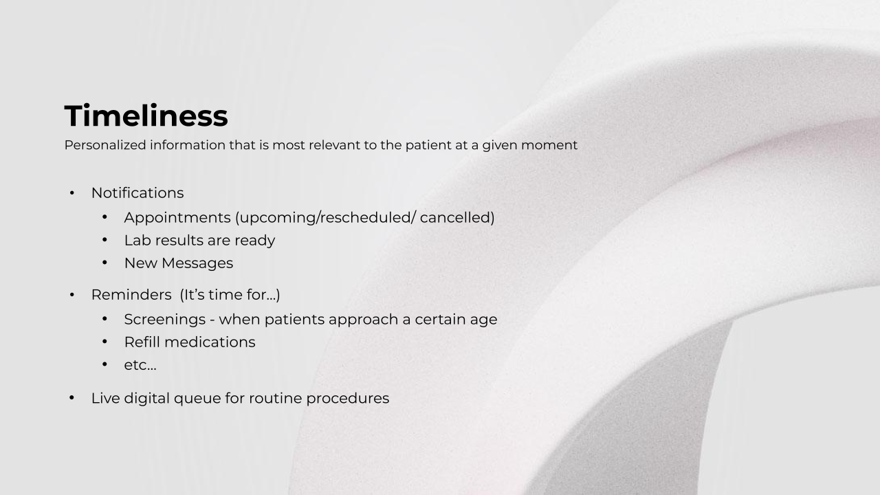
Feature Deep-Dive: ED Wait Times
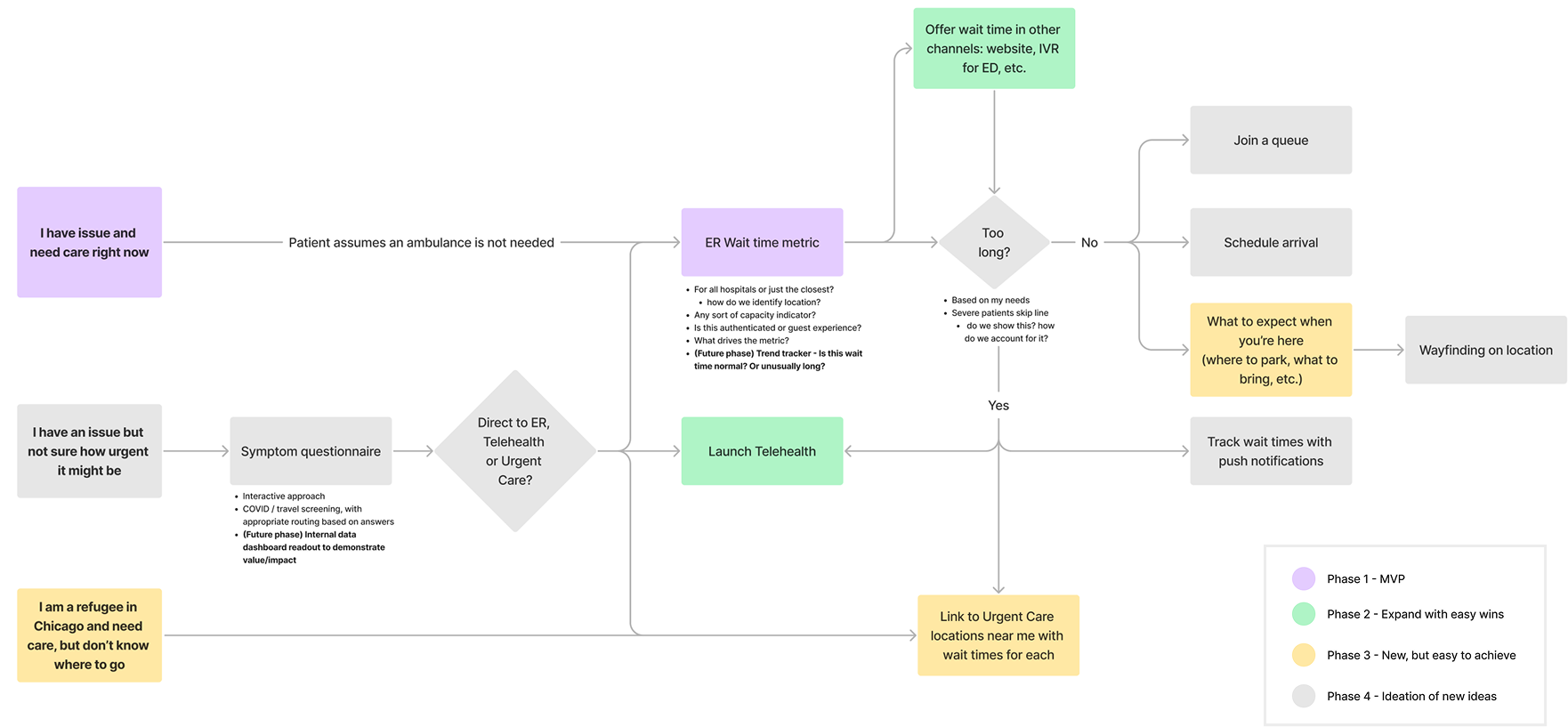
We explored the feasibility of displaying Emergency Department wait times to help patients make informed decisions during stressful moments, while also guiding those who saw the ER as their only option. I collaborated with our lead developer to map out a phased approach for enhancing the feature over time and capturing trend data for future improvements.
Wireframes to Comps
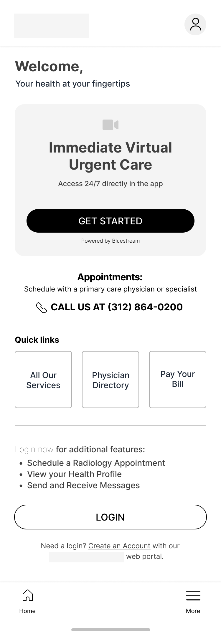
MVP Landing Page
The new app introduced a major visual and navigational shift, so the landing page needed to balance accessibility with simplicity. Research showed that patients struggled with multi-layered menus, so I prioritized key features upfront while keeping the design intuitive and approachable.
For non-MVP features, like appointment scheduling, I provided clear direction so users could still complete the action they expected, even if it wasn’t yet available in the app.
Current App
Scrollable ↓
Wireframe - Guest
Wireframe - Logged In
Comp - Guest
Comp - Logged In


Scheduling
Although scheduling didn’t progress beyond Radiology wireframes, I was able to design a streamlined flow that balanced patient preferences with doctor requirements. The experience simplified appointment booking by reducing the complexity of tiny calendars and scrolling through lists of options.
Scrollable ↓
Appointment Type

Set Preferences
Select Time
Review and Add Notes
Confirmation


Feature Highlights
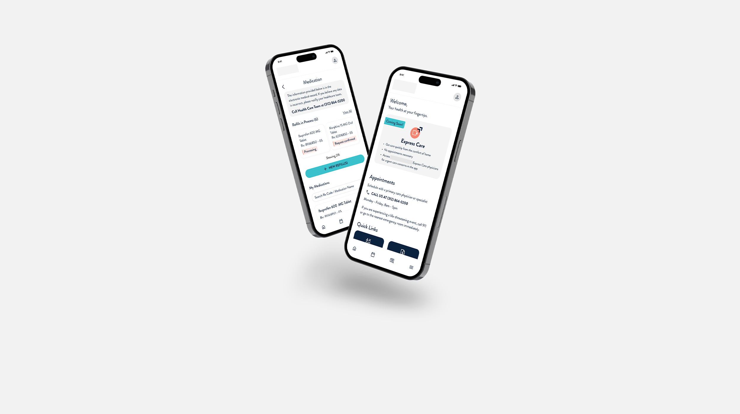
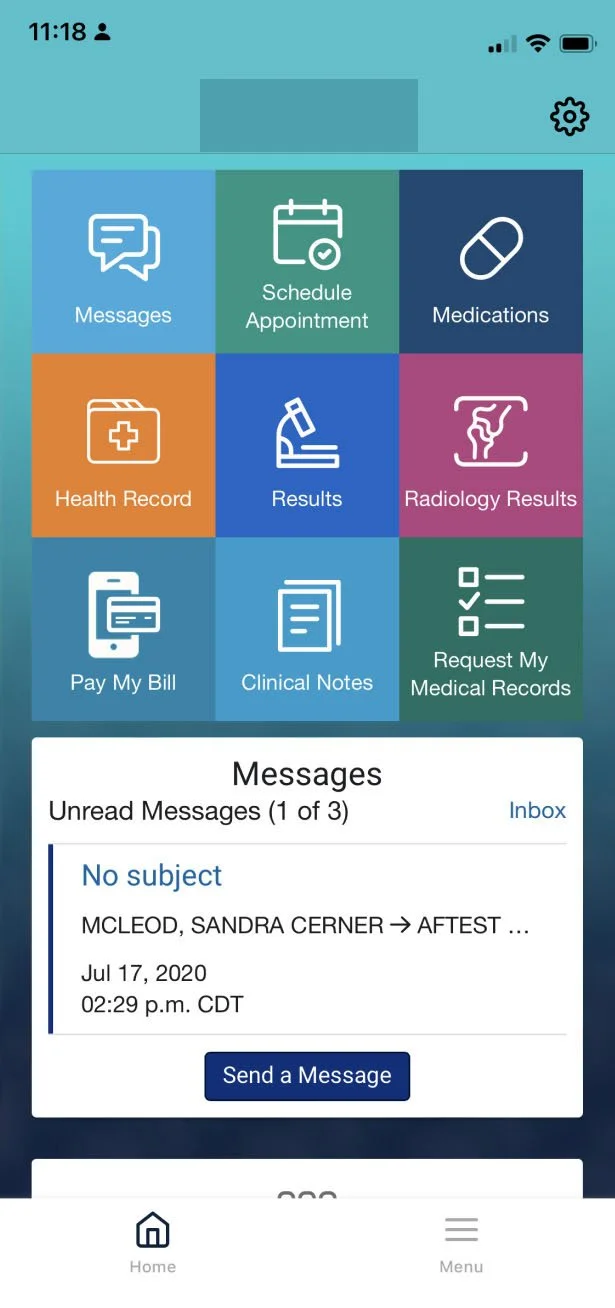
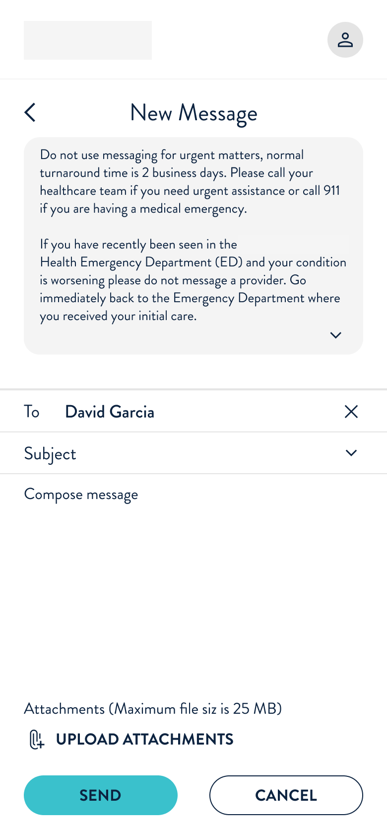
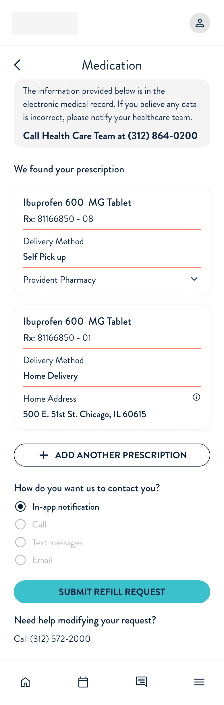
The core features developed within the app were Health Profile, Messages, and Rx Refill, each requiring integration with different third-party vendors.
While Health Profile and Messaging received UI enhancements with minor functionality updates,
Rx Refill was a game-changing addition, allowing patients to request and track prescriptions digitally instead of being forced to visit pharmacies in person. To simplify tracking, I designed a color-coded system that let patients know the status of their prescription at-a-glance.
Scrollable ↓
Health Profile
Health Profile - Allergies


Messages
New Message

Medications
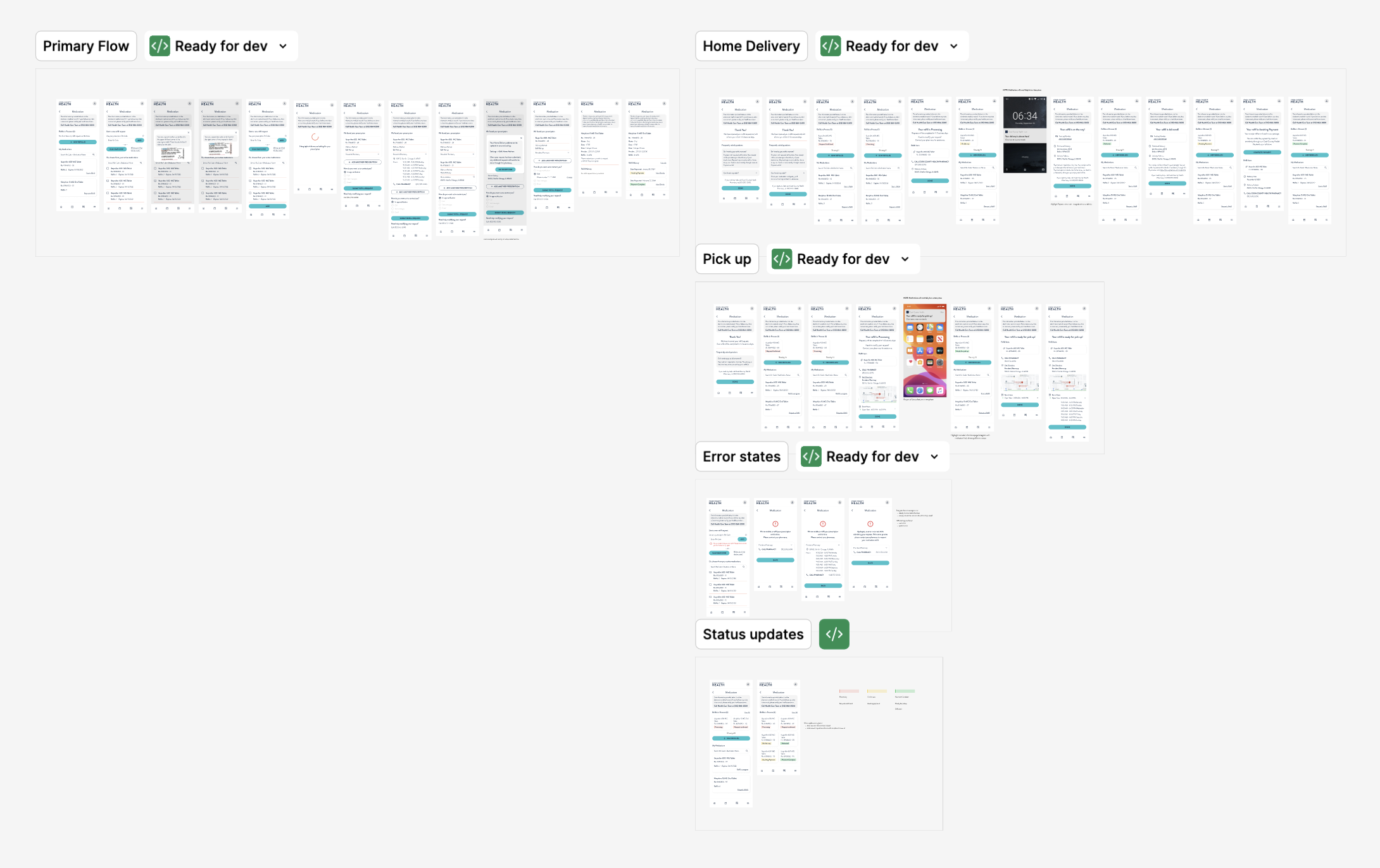
New Refill Request
Refill Request Details
Ready for Pickup


Out for Delivery

Comp & UI Delivery
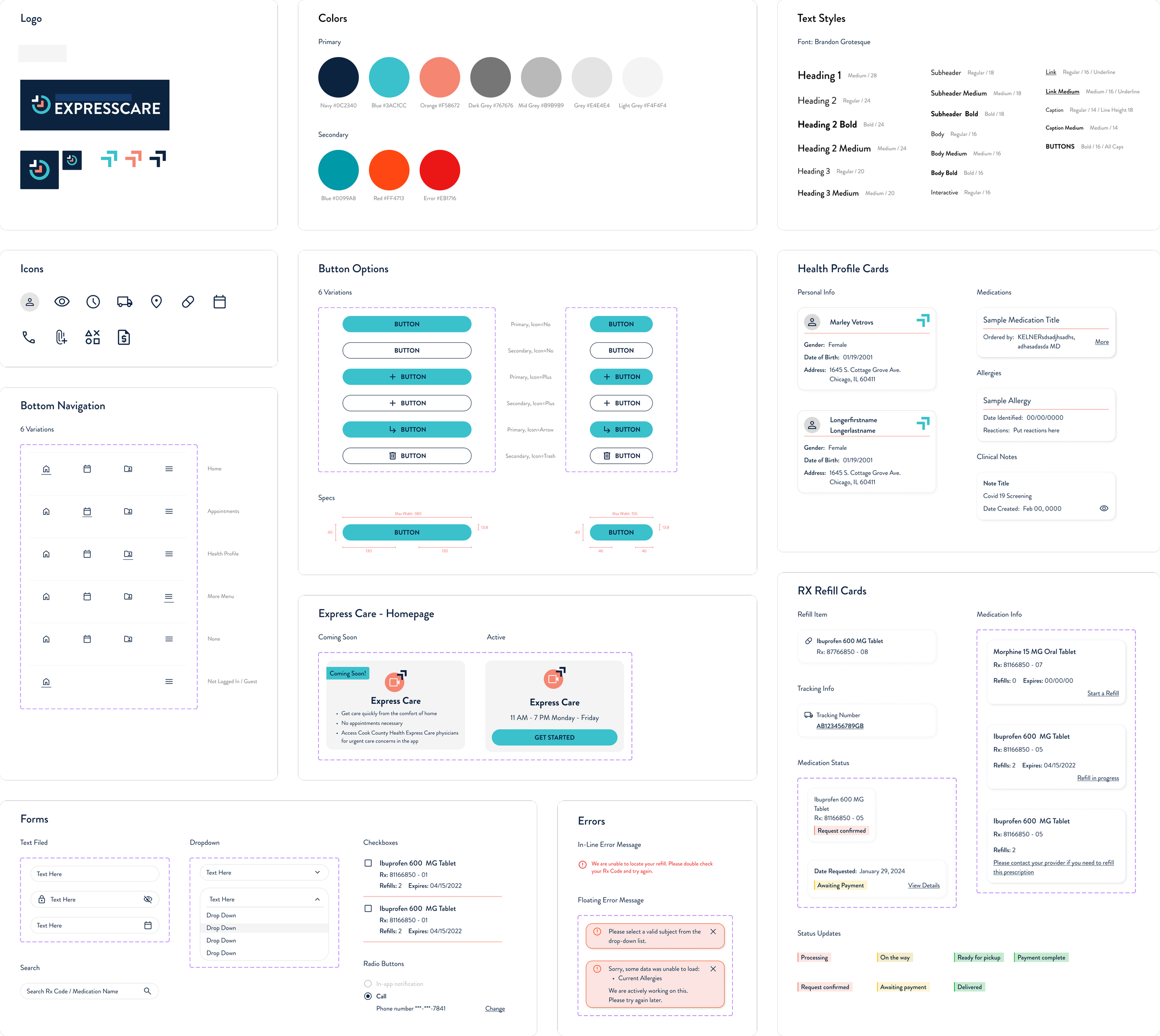
When delivering design comps to development, I ensure all potential interactions are accounted for. Screens are grouped, labeled, and annotated for clarity, alongside a clean component library and style guide. This system equips the development team with the information they need to minimize assumptions and maintain design integrity.
Comp Delivery Example
UI Kit Example
Conclusion
This project was an exercise in balancing digital innovation with patient needs, ensuring technology supported, not replaced, the human touch. Due to budget constraints, the project was paused after the MVP phase, but we focused on setting the foundation for long-term success. Thoughtful feature rollout, strategic planning, and collaboration positioned the provider to seamlessly continue development when they are ready to move forward.
Key Takeaways
Designing in phases required strategic prioritization to maximize impact within budget constraints.
Patients value digital convenience but not at the expense of personal interactions, emphasizing the need for a hybrid approach.
Collaboration with development was key to ensuring feasibility and maintaining design integrity through evolving requirements.